 United States
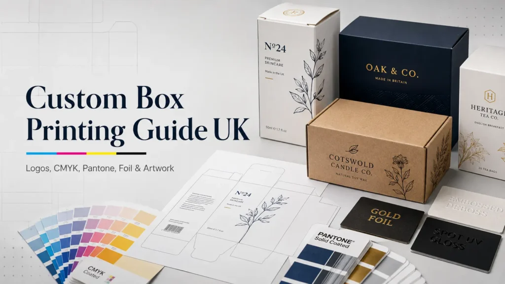
A box can look perfect on a laptop screen and still print poorly. Colours can shift, logos can lose sharpness, text can sit too close to a fold, and premium finishes can miss their intended position. Most of these problems start before the printing press begins.
Custom box printing works best when the printing method, colour system, packaging material, dieline, artwork and finish are planned together. For UK brands ordering retail, ecommerce or luxury packaging, understanding these choices makes approvals easier and reduces the risk of expensive artwork changes or reprints.
What Is Custom Box Printing?
Custom box printing is the process of applying brand artwork, colours, text, images and product information to packaging made for a particular product or business. Printing may appear on the outside, inside or both sides of a box. The production method depends on the box material, artwork complexity, quantity and required finish.
The basic custom packaging design process usually moves through these stages:
- Choose the box structure and material.
- Confirm the final dimensions.
- Create or receive the packaging dieline.
- Position the branding and artwork.
- Select CMYK, Pantone or another colour specification.
- Choose the printing process.
- Add finishes such as foil, embossing or Spot UV.
- Check a digital proof or physical sample.
- Approve the files for production.
Packaging prepress sits between the creative design stage and the actual production stage. It checks colour setup, structural alignment, bleed, safe areas, fonts and other technical details before artwork reaches the press. Esko describes packaging prepress as the process that converts design files into verified, print-ready output.
If your box dimensions are not confirmed yet, start by checking How to measure a box correctly before creating final artwork.
Which Packaging Printing Method Should You Choose?
There is no single best box printing method for every project. Digital printing is useful for flexible and shorter production runs, offset printing suits high-quality folding carton work, and flexographic printing is widely used across packaging substrates, including corrugated applications. Quantity, material, colour expectations and artwork complexity should drive the decision.
| Printing method | Often suited to | Main advantage | Main consideration |
| Digital printing | Shorter runs, prototypes, versioned designs | Fast setup and artwork flexibility | Unit economics can change as quantities rise |
| Offset or lithographic printing | Folding cartons, detailed retail packaging | Fine detail and strong print consistency | Requires more conventional press setup |
| Flexographic printing | Corrugated packaging and other packaging substrates | Efficient production across many packaging formats | Artwork should be prepared for the chosen flexo process |
| Litho lamination | Premium printed corrugated boxes | Combines detailed graphics with corrugated strength | Adds another production stage |
Koenig & Bauer’s packaging press range reflects the variety found across commercial production: digital, flexographic and sheet-fed offset systems are all used for different packaging applications.
Digital vs Offset Printing for Packaging
Digital printing removes many conventional plate-related setup requirements and makes artwork changes or versioning easier. Offset printing uses fixed printing plates and remains a strong choice where consistent, detailed printing is required across established production runs. Neither method should be selected from quantity alone; substrate, size, colour and finishing also matter.
HP notes that digital presses can produce changing or personalised content without the individual setup associated with static offset plates. That makes digital production particularly useful for shorter runs, prototypes, localisation and packaging campaigns containing several designs.
Offset becomes attractive when a job benefits from conventional sheet-fed production, precise colour management and efficient repeat printing. The final cost comparison should include setup, box quantity, number of designs, print coverage and finishing rather than only the quoted price per box.
For a launch where demand is still uncertain, Low MOQ custom packaging can also make it easier to test packaging before committing to a larger run.
Where Does Flexographic Printing Fit?
Flexographic printing is a packaging production method commonly used on materials such as paper, cardboard, and corrugated board. It is particularly relevant where repeat production and efficient printing across packaging substrates matter.
Modern flexo equipment can handle paper, films, and cardboard, while dedicated flexo post-print systems are also used directly on corrugated board.
For simple Branded shipping packaging, flexo can be a practical option. For photographic detail, premium folding cartons or highly controlled luxury artwork, another process may be more suitable.
How Do You Print a Logo on Custom Boxes?
To print a logo clearly on a box, start with a high-quality artwork file, place it on the correct dieline, and define the intended colour system before production. The printer also needs to know whether the logo should be printed conventionally, foiled, embossed, debossed, or combined with another finishing technique.
A reliable workflow looks like this:
- Use the original vector logo where possible.
- Confirm the final box dimensions.
- Apply the correct structural dieline.
- Keep the logo away from unsafe cut and fold areas.
- Specify CMYK or the correct Pantone reference.
- Decide whether the logo needs a special finish.
- Check its position on a flat proof and 3D mock-up.
- Request a physical sample when colour or placement is critical.
Vector files are especially useful for logos because they can scale without becoming pixelated. Tiny text, very thin lines and overly complex details can still create production problems, particularly when foil, embossing or other finishing dies are involved.
The logo should also be judged on the actual box material. White coated board, brown Kraft stock and textured paper do not produce the same visual result.
CMYK vs Pantone for Packaging: What Is the Difference?
CMYK creates colours by combining cyan, magenta, yellow and black process inks, making it suitable for photographs, gradients and multi-colour artwork. Pantone spot colours are useful when a particular brand colour needs tighter specification. Packaging can also combine CMYK artwork with selected spot colours where the production method allows it.
| Factor | CMYK | Pantone or spot colour |
| Colour creation | Four process colours combined | Specified individual colour |
| Best for | Photos, illustrations, gradients, multi-colour graphics | Brand-critical solid colours |
| Colour range | Wide process-colour range | Defined spot-colour references |
| Branding use | Good for most full-colour designs | Useful for controlled signature colours |
| Cost impact | Efficient for artwork using many colours | Extra spot inks may affect production cost |
| Combination | Can be used alone | Can sometimes be added alongside CMYK |
When Should You Use CMYK?
Choose CMYK when your packaging contains:
- Product photography
- Colourful illustrations
- Gradients
- Several colours
- Detailed printed backgrounds
- Seasonal graphics
- Full-panel artwork
CMYK is the standard starting point for many custom printed boxes because four process colours can reproduce a broad range of artwork.
When Is Pantone Better?
Pantone becomes useful when a specific colour is central to your brand identity. A company known for one precise blue, orange or green may want a defined spot-colour reference rather than relying only on a CMYK approximation.
Pantone’s own colour systems also distinguish between spot colours and their CMYK simulations. A converted CMYK value can look close to a chosen Pantone colour without being identical.
Paper makes a difference too. Ink printed on coated stock can appear different from the same specification on uncoated or Kraft material. Lamination and varnish may alter the perceived colour again.
A sensible packaging colour matching guide therefore starts with the substrate, print process and physical colour reference rather than a computer monitor alone.
What Is a Packaging Dieline?
A packaging dieline is the flat structural template used to position artwork around the areas that will eventually be cut, creased, folded and assembled into a box. It gives designers a production map showing where each panel sits and helps prevent important artwork from crossing unsuitable structural areas.
A packaging dieline may show:
- Cut lines
- Crease or fold lines
- Glue areas
- Front, back and side panels
- Lid and base areas
- Bleed boundaries
- Safe artwork areas
- Window locations
- Insert or locking features
Do not treat a dieline as decoration. Its geometry controls how flat artwork becomes a three-dimensional pack.
A logo that looks centred on the flat file may appear too close to an edge once the carton is folded. Text placed across a crease can become difficult to read. Background artwork that ends exactly on a cut line may leave an unwanted white edge after trimming.
Esko identifies dieline verification, structural fit, bleed and safe-area checks as core parts of packaging prepress.
How Do You Prepare Print Ready Packaging Artwork?
Print-ready packaging artwork should use the final approved dieline, correct colours, sufficient bleed, safe positioning and properly prepared fonts and images. Every printer can have slightly different file requirements, so the production specification should always override generic artwork settings.
Before approval, check the following.
Use the Final Dieline
Do not design around an old template or a box size that is still changing. Even a small structural revision can shift folds, panels, and finishing positions.
Extend Backgrounds Into the Bleed
Bleed allows printed artwork to extend beyond the final cut edge so minor trimming variation does not leave an unprinted line.
Adobe states that 3 mm is a typical industry bleed, while also advising designers to confirm the required amount with their print provider.
A background colour, photograph or pattern touching the edge should extend through the bleed area. Important text and logos should move in the opposite direction: keep them safely inside the trim and fold boundaries.
Keep Important Content Inside Safe Areas
Product names, barcodes, ingredients, instructions and logos should not sit directly against cut lines or creases. The required safe distance depends on the structure and manufacturing process.
Check Your Colour Setup
Do not accidentally leave RGB web graphics inside production artwork. Confirm which items are intended as CMYK builds and which are intended as named spot colours.
Check Fonts and Linked Assets
Missing fonts and broken image links can change a design during file handling. Follow the printer’s preferred workflow for embedding or outlining fonts and packaging linked artwork.
Separate Technical Elements Clearly
Dielines, spot finishes, white ink, foil, embossing and other production elements should be clearly identified rather than merged into ordinary graphics.
Packaging-specific preflight systems check issues such as colour mode, image requirements, fonts, bleed, safe areas, ink naming and overprint before files move into production.
Which Custom Box Printing Finishes Create the Best Result?
The best finish is the one that strengthens a specific part of the design rather than covering the box with effects. Foil can draw attention to a logo, embossing adds physical depth, debossing creates a pressed impression, and Spot UV produces selective gloss. Combining too many finishes can make packaging costly and visually busy.
| Finish | Visual or tactile effect | Often used for |
| Foil stamping | Metallic or coloured reflective detail | Logos, names, borders |
| Embossing | Raised surface | Logos, symbols, patterns |
| Debossing | Recessed surface | Minimal branding, premium typography |
| Spot UV | Gloss on selected areas | Logos, patterns, contrast |
| Matt lamination | Smooth, low-glare surface | Premium and minimalist boxes |
| Gloss lamination | Shiny overall appearance | Bright graphics and bold colours |
| Soft-touch finish | Soft tactile surface | Luxury presentation packaging |
Foil Stamping Packaging
Foil stamping adds a separate decorative layer rather than simply printing metallic-looking ink. Hot foil applications typically use a die, heat, and pressure to transfer foil onto selected parts of the packaging.
Gold and silver are familiar choices, but foil can also be supplied in other colours and effects. The strongest results usually come from restraint: a small foil logo on a clean surface can have more impact than covering every panel.
Embossing vs Debossing Packaging
Embossing raises a selected design above the surrounding surface, while debossing presses it into the material. Both create physical depth, so customers can feel the branding rather than only see it.
Embossing often works well for logos or symbols that need stronger visual presence. Debossing can suit restrained typography and minimalist packaging.
Fine details should be reviewed carefully because paper thickness, board construction, and artwork size influence how cleanly the effect can be formed.
What Is Spot UV Packaging?
Spot UV is a selective glossy coating applied to chosen areas rather than the complete printed surface. It can create visible contrast between a matt background and a shiny logo, pattern, or product name.
99 Custom Boxes uses Spot UV alongside options including CMYK, Pantone matching, foil stamping, embossing, and debossing across several packaging styles.
Brands exploring more premium combinations can also compare the finishing options used on Branded gift boxes.
What Are the Most Common Packaging Printing Mistakes?
The most expensive custom box printing mistakes usually happen before production: using the wrong dieline, relying on screen colour, forgetting bleed, approving poor-quality logo files, or choosing finishes before checking whether the artwork suits them. A structured proofing process catches these issues while they are still easy to correct.
Watch for these common problems:
- Designing before final box dimensions are confirmed
- Using screenshots or low-quality logo files
- Building brand colours only from RGB or HEX references
- Placing text directly against folds or cut lines
- Forgetting packaging bleed
- Sending the wrong dieline version
- Using too many print finishes at once
- Failing to label foil or Spot UV layers clearly
- Expecting Kraft board to reproduce colours exactly like white coated stock
- Approving spelling without checking every panel
- Assuming a 3D render proves physical fit
- Skipping a physical sample for a structurally unusual box
The final proof should be checked panel by panel. Front artwork may be obvious, but small errors often hide on side panels, bases, inside flaps and glue areas.
Should You Request a Packaging Prototype or Sample?
A prototype is worth considering when the box has an unusual structure, fitted insert, premium finish, critical brand colour or high-value product. Digital proofs help check layout, but a physical sample gives additional information about scale, board feels, folding, product fit and how finishes behave under real light.
Sampling is particularly useful for:
- New product launches
- Luxury packaging
- Fragile products
- Boxes with inserts
- Drawer or magnetic structures
- Pantone-sensitive branding
- Large foil areas
- Complex embossing
- Ecommerce packs being tested for presentation
Not every project needs a fully printed production sample. A plain structural prototype may be enough to check size and fit, while a printed sample is more useful when colour and finishing are key concerns.
For ecommerce applications, Custom mailer boxes can also be produced with custom dimensions, print options, finishes and proofing support. 99 Custom Boxes lists flat views, 3D mock-ups and physical sampling options for these packs.
Can Custom Box Printing Be More Eco-Conscious?
A more responsible print specification usually starts by removing unnecessary materials rather than adding an “eco” label. Choose an appropriate paper-based structure, avoid excessive surface treatments, use only the finishes that add real value, and consider whether coatings or laminates could affect the recycling route of the finished pack.
For example, a heavily laminated box with several decorative layers may behave differently in recycling systems from a simpler paper-based pack. The effect depends on the materials and construction, so sustainability claims should be checked against the actual specification rather than assumed.
Print efficiency matters as well. A correctly sized dieline, approved artwork and sensible order quantity can reduce avoidable production waste caused by revisions or obsolete packaging.
How Should a UK Brand Choose Its Final Printing Specification?
Start with the job the box needs to do, then choose the printing specification. A luxury skincare pack, ecommerce mailer and high-volume retail carton do not need the same process. Product protection, order quantity, colour control, customer experience, budget and repeat-order requirements should all influence the final decision.
A practical decision sequence is:
- Confirm the product and box size.
- Choose the correct board for handling and presentation.
- Decide how much artwork needs printing.
- Choose CMYK, Pantone or a combination based on brand requirements.
- Select digital, offset, flexo or another suitable production process.
- Add only the finishes that support the design.
- Check the dieline, bleed and safe areas.
- Review proofing and sample options.
- Approve the complete specification before production.
A premium box does not automatically need every available finish. Sometimes accurate colour, clean typography and one carefully positioned foil logo create a stronger result.
Get Your Custom Box Artwork Ready for Production
Good printing begins long before ink reaches the board. Box structure, artwork, colour and finishing should work as one system. If any one of them changes, check the others again before approving production.
99 Custom Boxes supports UK businesses with custom sizing, box templates, printing, colour options, premium finishes and artwork guidance across different packaging styles.
If you already know your dimensions and have your artwork ready, compare the available printing and finishing options before Requesting your final quotation or sample.
Frequently Asked Questions
1. What Is the Best Printing Method for Custom Boxes?
The best method depends on quantity, material, and artwork. Digital printing offers flexibility for shorter or changing runs. Offset is strong for detailed folding carton work, while flexographic printing is widely used across packaging materials and corrugated applications.
2. Can I Print My Logo on Cardboard Boxes?
Yes. A logo can be printed directly onto suitable cardboard packaging or highlighted using foil, embossing, debossing or Spot UV. Supply a clean artwork file and use the final box dieline so the logo can be positioned correctly.
3. Should I Use CMYK or Pantone for My Logo?
Use CMYK when the logo sits within full-colour process artwork and an accurate CMYK reproduction is acceptable. Consider a Pantone spot colour when a specific solid brand colour needs tighter specification. Some packaging jobs can combine both systems.
4. How Much Bleed Does Packaging Artwork Need?
A 3 mm bleed is commonly used, but the final requirement should always come from the printer or packaging producer handling the job. Adobe identifies 3 mm as a typical industry standard while advising users to confirm the correct specification with their print provider.
5. What Is the Difference Between a Dieline and Artwork?
The dieline defines the physical packaging structure, including cut, fold, and other production boundaries. Artwork contains the visual design placed around that structure. The artwork must align correctly with the approved dieline before printing.
6. Is Foil Better Than Spot UV?
Neither is automatically better. Foil creates a reflective decorative effect, while Spot UV adds selective gloss. Foil often suits metallic logos and premium accents; Spot UV works well for subtle contrast on matt surfaces. Choose according to the brand design and packaging material.